Let’s start with our landing page. Instead of judging a page on opinion and preference let’s based the teardown on proven persuasion principles. I’m going to use these principles like a gap analysis tool. These are critical components to building a persuasive argument. All I have to do is go over the copy and ask whether or not I’m including those elements on not.
A Teardown In 20 Questions#
What does the product do?#
- Could a child understand what your product does, based on the headline?
- Does the byline explain how your product does what it claims to do in ten words or less?
- Does the landing page contain a screenshot, demo or sample of what’s being offered?
- Does the header copy match the pre-click ad or SERP copy?
Why should I care?#
- Is the focus on acquiring a desired outcome or eliminating a core pain?
- Are these desires/pains described in specific, vivid detail?
- Do the words bridge the product to the acquisition of the desired outcome?
- Does the copy explain what advantages your product has over other existing solutions?
How do I believe you?#
- Does the landing page show proof of the desired outcome you promised?
- Do you show easily verifiable endorsements from the target market or high-profile media?
- Does the copy include impressive metrics that summarise the product’s popularity?
- Does your landing page offer a guarantee or refund?
How do I get started?#
- Is your call-to-action, headline, and core benefit located close to each other and above the fold?
- Is the call-to-action obvious twenty steps away from the screen?
- Does your call-to-action start with a verb and describe what will happen next ( Start trial, See pricing, Join waiting list)?
- Does the landing page address people’s most common objections?
For each question, I assign a score of zero if the answer is no, 2 if the answer is yes, and 1 if the answer is somewhat, but could be improved. Then I tally up my score for each section so that I can prioritize which aspect of my messaging needs attention first.
This is Chirr App’s existing pricing page. I ran through each section and got a total score of 13 points. So the page is about 40% as effective as it could be.
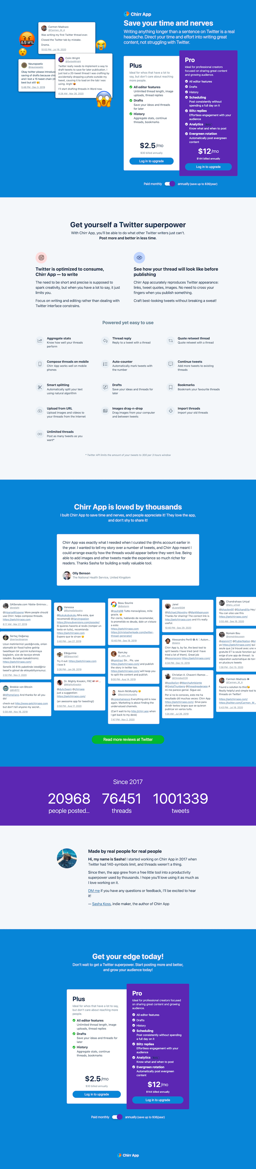
I gave the What does the product do section a score of 0, the Why should I care section got 5 points, and the other two sections got 4 points each.
There’s a lot of leeway in how you interpret each of the points, and there could be hundreds of different points in each section. You can spend days getting lost in minutiae here, but I limited this exercise to my top 4 four things in each category so I could identify what’s broken as quickly as possible and then fix it to see if you’re on the right track.
Feel free to use these 16 questions as a starting point and then modify it to use whatever framework or set of principles you’re comfortable with. What’s important is that you have a clear, shared, repeatable framework for assessing your messaging that everyone on your team agrees on.
Messaging Hierarchy#
People of the internet have been building landing pages for a while now and have established a sequence to the sections on a landing page that works.
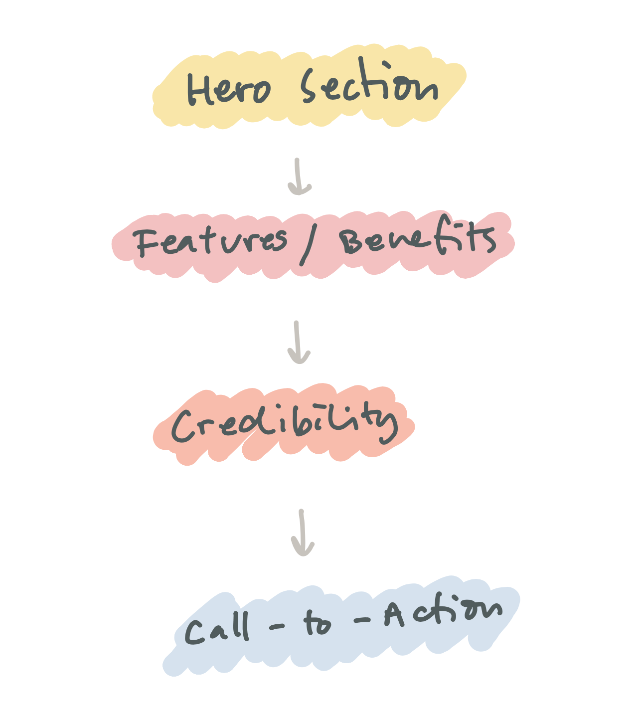
The Hero Section#
A Helpful Headline – Imagine a five-year-old finds your product and asks you what it is. Your response should help the child understand what your product does and who it’s for. Prioritize clarity and brevity.
People don’t read much online. Typically, they just want information quickly. They look at stuff that is either new, unusual or helpful. New gets old. Unusual can be good if it works. Helpful is a solid bet. Use your headline to tell people how your product helps them.
Defining who your product is for in your headline is also a good way to filter out people you cannot help. You only want interested people to continue reading. Avoid getting people to read stuff only to discover that it doesn’t apply to them at the end.
A Supporting Byline – Our hypothetical five-year-old understands what your product does, now explain how it does it in ten words or less.
** A Preview** – This could be an image, a screenshot, a video, a demo. The idea is to reinforce what you are talking about with a clear visual depiction of the thing so that there are no misunderstandings.
Your call-to-action – There is a whole section dedicated to your CTA below but you always want to include one above the fold to let the people who don’t need persuasion proceed right away.
Features & Benefits#
Imagine the five-year-old challenges you and asks you why someone would need your product. You must highlight the core problems it solves.
Our brains are fine-tuned to detect problems. A giant piece of cake on the sidewalk might get your attention but a tiger will stop you dead in your tracks.
When you have a specific problem, a specific group of people and a solution you can construct a trigger.
People: 5-year-old children
Problem: Being scared of the dark
Solution: A bedside lamp that projects a faint night sky onto their ceiling.
Trigger: We help kids enjoy going to bed by letting them explore the universe on their ceiling before they fall asleep.
When deployed well, a trigger will prompt someone to ask “What do you mean by that?” which actually means, “Tell me more”.
This idea of a trigger is taken from a book called The Brain Audit by Sean D’Souza. He says that the ‘kiss of death’ is when someone says ‘oh! that’s interesting’. What they are actually saying is ‘No thank you, I want to escape this awkward interaction now’.
If our five-year-old thinks your product is “interesting” then it’s game over. You’ve lost them. You need to start from the top and rework your trigger.
On the other hand, if her response is akin to “What do you mean by that?”, then it’s time to explain what your product can do for her.
Another way to communicate the benefits of your product is to list out everything people resort to when they don’t have your product. Then outline all the problems with each of these alternatives. Finally, explain how and why your product is better. That’s what your product can do for me. Now pick your top three.
If you are still left with a bunch of features that describe your product and not its benefits, another solution is to add “which means that…” to the end of your feature sentences. For example: “Our products are only made with organic ingredients which means that they are good for you and they taste delicious”.
Credibility#
Imagine the child’s parents just showed up. They are skeptical and want to know what’s going on here. You need to back up your claims and disarm the most common objections with facts and specific data.
Objections are good by the way. They are an indicator of interest.
Disinterested customers won’t object, they won’t ask questions, they just walk away. When someone engages with your product, that’s when they start asking questions. Objections mean engagement.
If the objection is valid and you can’t address it then they are not the right person for your product. Work on eliminating them well before they get to this stage. Be clearer about who your product is for in your headline.
Brainstorm all the possible objections to your thing and then address them one by one. If you can get someone else to address the objections for you, even better.
Testimonials – There always come sugar-coated. People can taste sugar. A good testimonial starts with skepticism. They describe the fear and uncertainty going through people’s heads when they first considered your product.
A reverse testimonial works because it speaks to us, in the way we speak to each other. When we’re recommending a restaurant, we intrinsically lace our recommendations with doubt.
The five questions you need to ask to get a powerful testimonial are:
- What was the obstacle that would have prevented you from buying this product initially?
- What happened as a result of buying this?
- What did you like most about the product?
- Would you recommend it? If so, why?
- Is there anything you’d like to add?
Once you link each objection to a testimonial, you can bring it home with a guarantee.
A Guarantee – If you’re getting lots of complaints, it means your product isn’t doing what it’s supposed to. Complaints are valuable feedback. Listen to them so that you can fix the problem.
Generally, someone who complains wants you to improve. People who don’t care won’t complain but will leave anyway.
A guarantee lets people know that they can complain and something will happen. Refunds are an early warning system. Use them.
That’s it.
The Call To Action#
Now the child is excited. Now they want to get involved. What is the next step?
Your call to action button text should start with a verb and describe what will happen next ( Start trial, See pricing, Join waiting list). The button should be obvious twenty steps away from the screen.
Putting it all together#
Rather than trying to fix everything at the same time, the teardown at the beginning of this post let me identify that the What does the product do aspect of the current pricing page was the bit that needed the most attention.
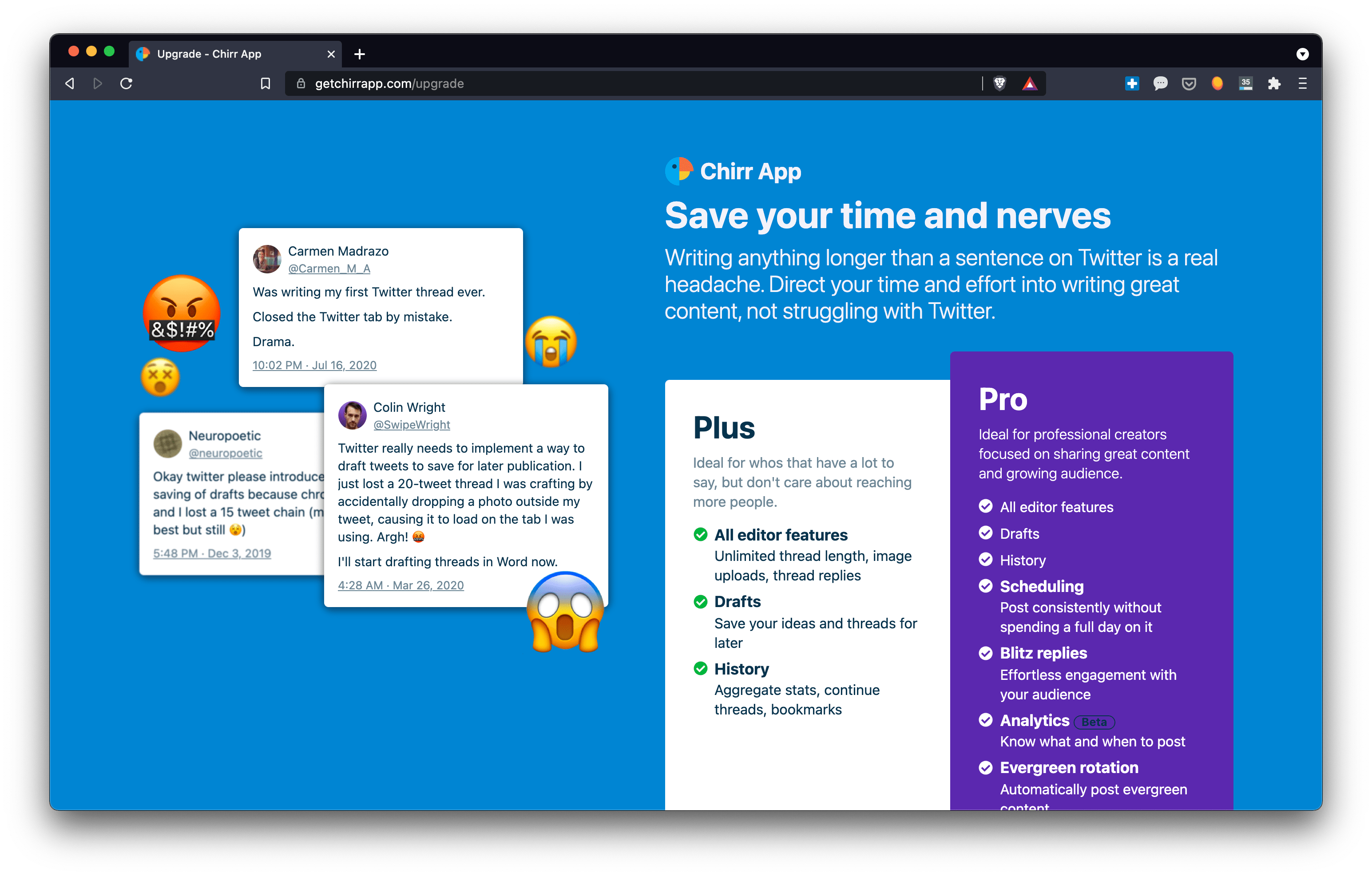
Our headline doesn’t really explain what the product does, nor does the byline outline how it does it and there wasn’t a preview or screenshot of the product anywhere on the page.
Without paying too much attention to all the other aspects of the teardown I just focused on fixing these three things first.

I went through the audit again on the new page and this time I scored 18 points. I added 6 points to the What does the product do (and I lost a point because we n longer have CTA above the fold).
This version of the landing page is currently being AB tested and I want to make sure that these changes have an impact on the conversion rate before I spend more time fixing all the other details.
Related Links#
- I got accepted to CXL institutes’ growth marketing mini-degree scholarship. The program runs online and covers 112 hours of content over 12 weeks. As part of the scholarship, I have to write an essay about what I learn each week.
- This is post 7 in a series. The rest of the posts are listed here.
- Most of what I learned in this post came from this course on product messaging by Momoko Price.
- If you’d like to get more updates on my growth marketing learnings you can follow me on Twitter @joshpitzalis.
