When I begin working on improving conversion for a landing page the starting point is always the value proposition.
A company called Marketing Experiments put together a heuristic for calculating the probability of conversion:
Conversion = 4 motivation + 3 value prop + 2 (incentive - friction) - 2 anxiety
The single biggest factor here is motivation. I can’t control why people want my product but you can understand it. Clearly understanding what brings someone to my products makes it easier to craft a value proposition that they can relate to. If I can craft an effective value proposition that speaks to people’s core motivation around my product then that’s more than half of the battle won.
If I were starting a restaurant I’d pick a hungry crowd over a fancy chef any day. I like to spend a disproportionate amount of time trying to figure out who my crowd is and what they are hungry for. I’m talking about researching competitors, listening for relevant conversations in related forums and communities, understanding what the customer support team already knows, conducting surveys, and most importantly, setting up customer interviews.
I’ve managed to conduct 15 customer interviews in the two months since joining Chirr App and we’ve surveyed exactly 199 people to date. If you’re one of the people I interviewed or if you filled out our survey, I am grateful for your time and feedback. I’m also now handling all of the customer support, which is basically free customer research.
This is painstakingly slow work, but it’s worth it. If you get it right it’s all downhill from here. If you get it wrong, nothing else really matters.
There are loads of ways to establish your value proposition. I like to take a volume-based approach. I list out every single problem I can think of or find a reference to, around the problem my product solves. Then whittle it down to the best ones.
By the end of it, I’ll either have a few different value propositions that I want to try out or I’m working on optimizing an established value proposition.
Either way, once I’ve narrowed in on a value proposition, the first step is always the headline. I work on figuring out the words first. Once the messaging is down for the whole page then I work on the design.
Start with the headline#
The headline is arguable the most important part of a landing page.
If someone read nothing else, would they understand what my product does?
I like to pretend the person I’m designing for has zero context. Let’s say they walk into the Apple store and this is the default page on a computer screen. I also like to assume they are not my target audience. I’m not trying to get them to buy anything. The litmus test is whether or not they understand the product clearly enough to recommend it to the right person when they’re having drinks with friends later in the day.
- Identify a feature that captures my product’s purpose
- Then clarify the benefit of the feature. Someone taught me this neat trick where you can translate any feature into a benefit by adding “which means that…” to the end of your feature sentence.
For example: “Our products are only made with organic ingredients which means that they are good for you and they taste delicious”
I don’t formulaically include “which means that…” in my headlines, it’s just an easy way to start thinking in the right direction.
- Then cut everything down to about 10 words so that it’s easy to read.
A mistake I’ve made with headlines in the past is to try and get fancy, now I just aim to be obvious. People don’t read much online. Typically, they just want information quickly.
On the Chirr app pricing page at the moment our headline is “Save your time and nerves”.

This makes sense because our pricing page isn’t really a landing page. Most people who get to our pricing page have already used the product.
However, I would like to drive some ad traffic to our landing page in the future. This means we have to make sure the headline makes sense with zero pre-existing context.
The current headline does not pass the litmus test of people being to understand what it does if they read nothing else, nor could they recommend it to the right person in casual conversation.
- To improve things, a feature I’m going to focus on to capture the product’s purpose is that it lets you turn long blog posts into Twitter threads.
- Which means that you can create Twitter threads easily and quickly.
- In less than 10 words I’m going to go with “Make Twitter Threads
quickly and easily.”
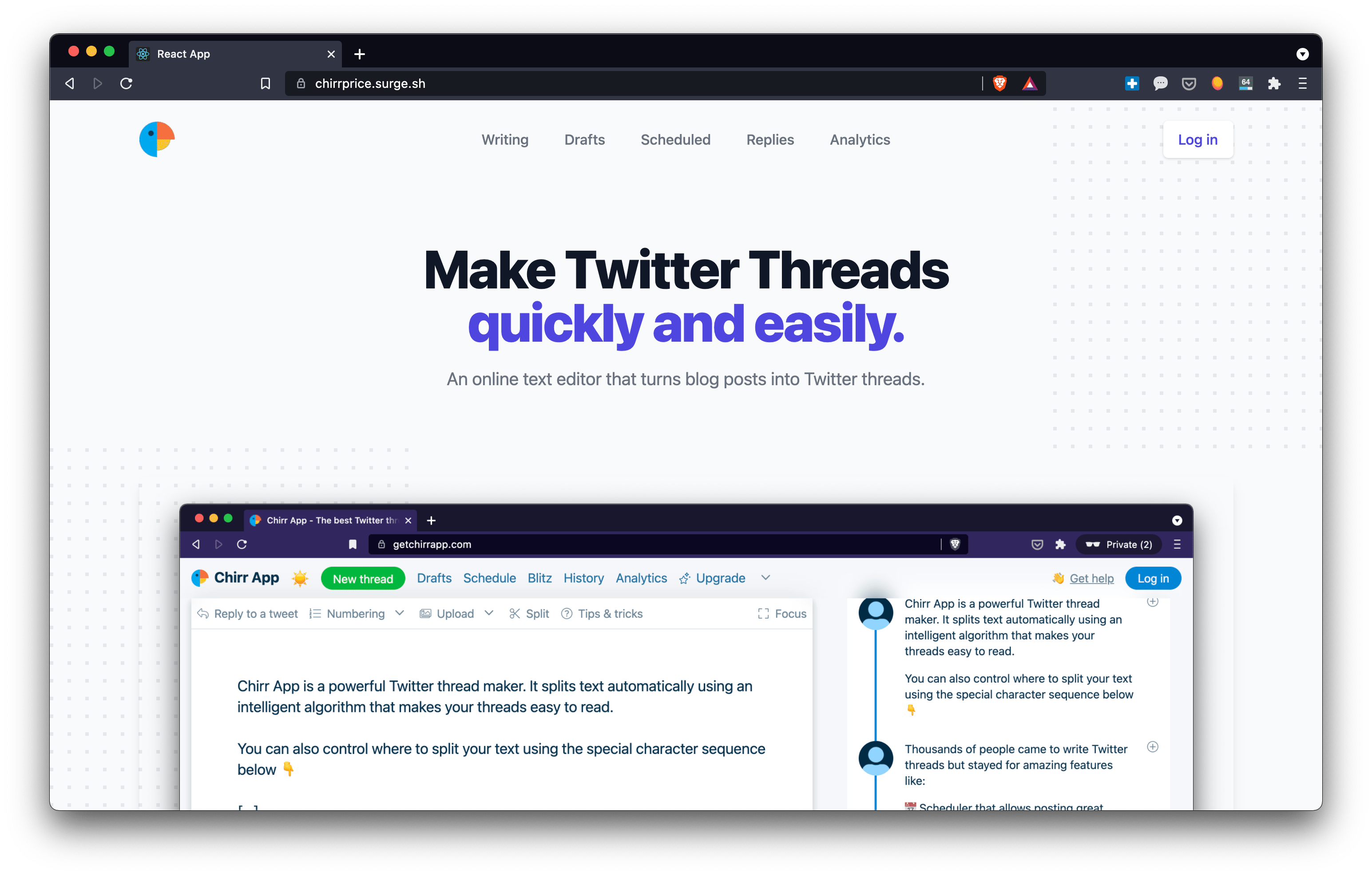
It’s not sexy, but it’s obvious. I’ll probably tweak this some more before any of these changes go live but that’s my thinking so far.
The subheadline#
If a good headline tells your audience what you do and why it makes their life better. Your subheader explains how you do it, again in 10 words or less and with zero fluff or jargon.
Feature sections#
I like to use my feature sections to handle common objections to using the product.
The idea is to communicate the core benefits of the product, explain the biggest problem our product solves, and address your main concerns and objections all in one go.
I aim for 3-5 features. The more expensive or unintuitive the product, the more objections I need to address.
A good feature description is made of three parts: a title, a description, and an image.
A title lets people decide if something is relevant#
A title describing your feature or its value in 5 words or less
I’m just trying to describe what it is so that people can decide if it’s relevant to them.
I have a group features, benefits, and objections that I want to focus on:
- If you want to use the native Twitter client to make threads you have to copy and paste your blog post into a notebook then count characters to figure out where the breaks go.
- the fact that you get sucked into social media when you trying to get content for Twitter on Twitter
- the fact that you can time stuff to go out when it has the best chance of reaching people.
For the first value prop, I came up with as many headlines as I can think of
- A one-Stop Twitter thread Maker
- Never copy & paste content again
- No more character counting
- See an exact preview of your thread as you write.
- Writing anything longer than a sentence on Twitter is a real headache.
- The native Twitter client is a pain to use for threads.
Then I try and trim the best ones down to 5 words or less
- One-Stop Twitter thread Maker
- Preview threads as you write
- No more copy-and-paste
- Threads on Twitter are painful
I’m going to go with ‘Preview threads as you write’ because I think that will make the most specific to anyone who has tried to create a long thread on Twitter and is then searching for a solution.
Then I repeated the same process of laying out options for the other two value props and then trimming then and picking the best one.
The description twists the knife#
If the title lets people skip over bits they don’t care about, then I’m going to assume anyone reading this description stopped here because they can relate to the value prop in the title.
Now I want to speak directly to the person (not in the third person) and go straight to their problem. If it goes on for more than 2 sentences I resort to bullet points. I try and end each line with a clear benefit.
I’m trying to point out what people are doing wrong and how I make things better. The ideal outcome is to reveal the larger implication of the issue and make them viscerally feel the pain of their problem in the headline.
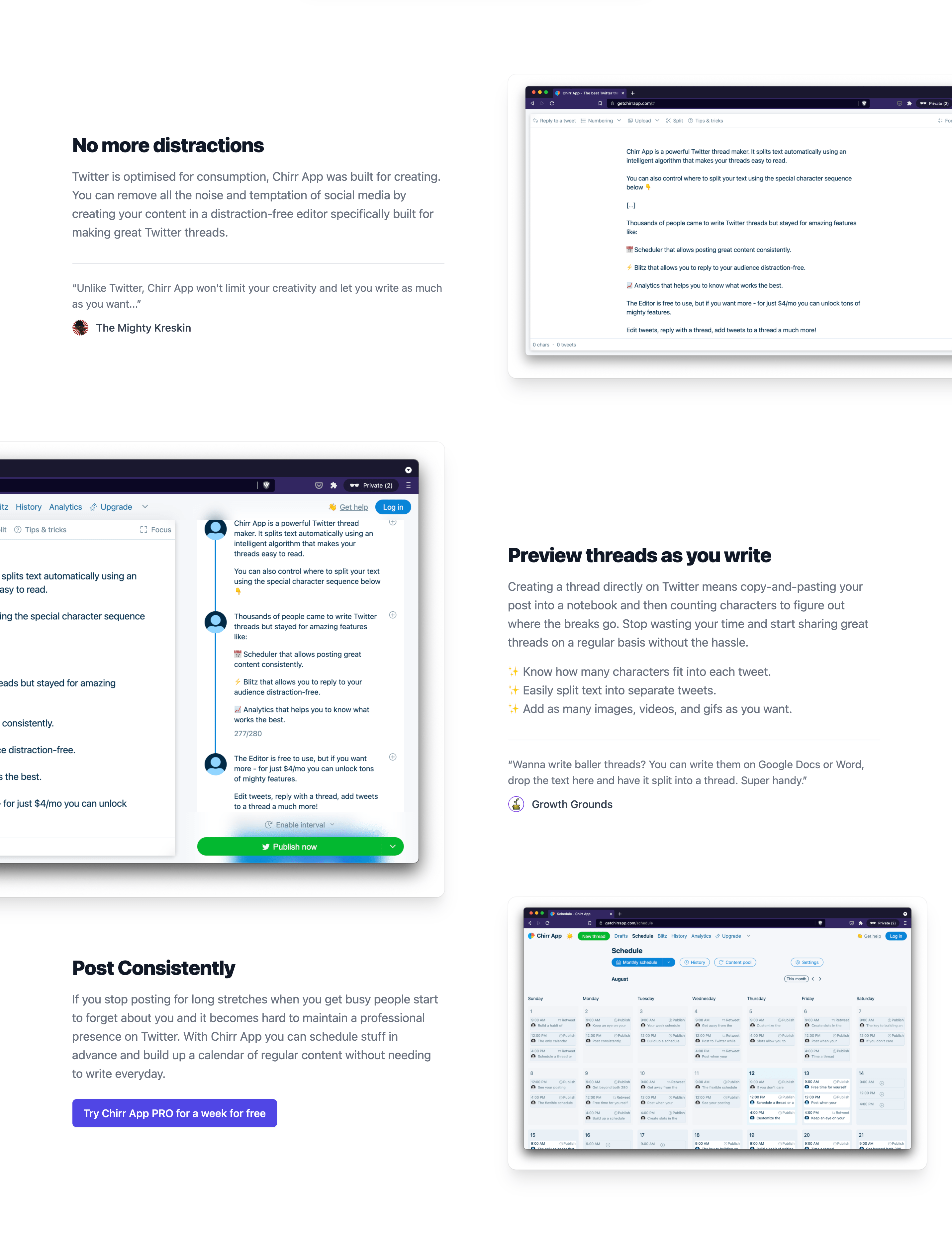
Preview threads as you write
Making threads in Twitter means copy-and-pasting stuff into a notebook, counting characters to figure out where the breaks go, and moving images around as you edit 🤯 Start sharing great threads on a regular basis without all the hassle.
✨ Know exactly how many characters fit into each tweet.
✨ Easily split text into separate tweets.
✨ Add as many images, videos, and gifs as you want.
Then demonstrate the feature in action#
Your feature’s image should visualize the feature in a way that puts everything into context. Even better, use an auto-playing GIF or SVG animation.
Here is everything put together.
This is all work in progress, I’ll continue to write about this as I improve our landing page, then I’ll AB test the changes and share them.
Links#
- I got accepted to CXL institutes’ growth marketing mini-degree scholarship. The program runs online and covers 112 hours of content over 12 weeks. As part of the scholarship, I have to write an essay about what I learn each week.
- This is post 3 in a series. The rest of the posts are listed here.
- If you’d like to get more updates on growth marketing you can follow me on Twitter @joshpitzalis.
