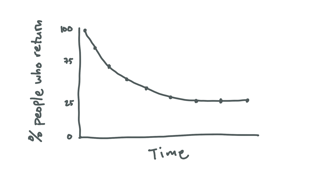
The best way I’ve found to measure retention is to plot a retention curve.
A curve shows you the average number of people that come back and use your product over time.
Before you can build a curve you have to define what “using your app” means. If you do rideshare it’s probably booking a cab, if you deliver food then it’s likely ordering dinner. Your core action should speak to people’s core motivation for signing up.
Then you need to figure out your usage interval. Picking the right usage interval comes down to understanding how often the problem happens.
If Airbnb looked at how many people booked nights every week, it would look like nobody uses their app more than once. People go on holiday once, maybe twice a year. It makes more sense to look at how many people book nights every year. What looked like lots of people leaving, now looks like lots of repeat business.
Once you have a core action and your usage interval you can construct a cohort chart.
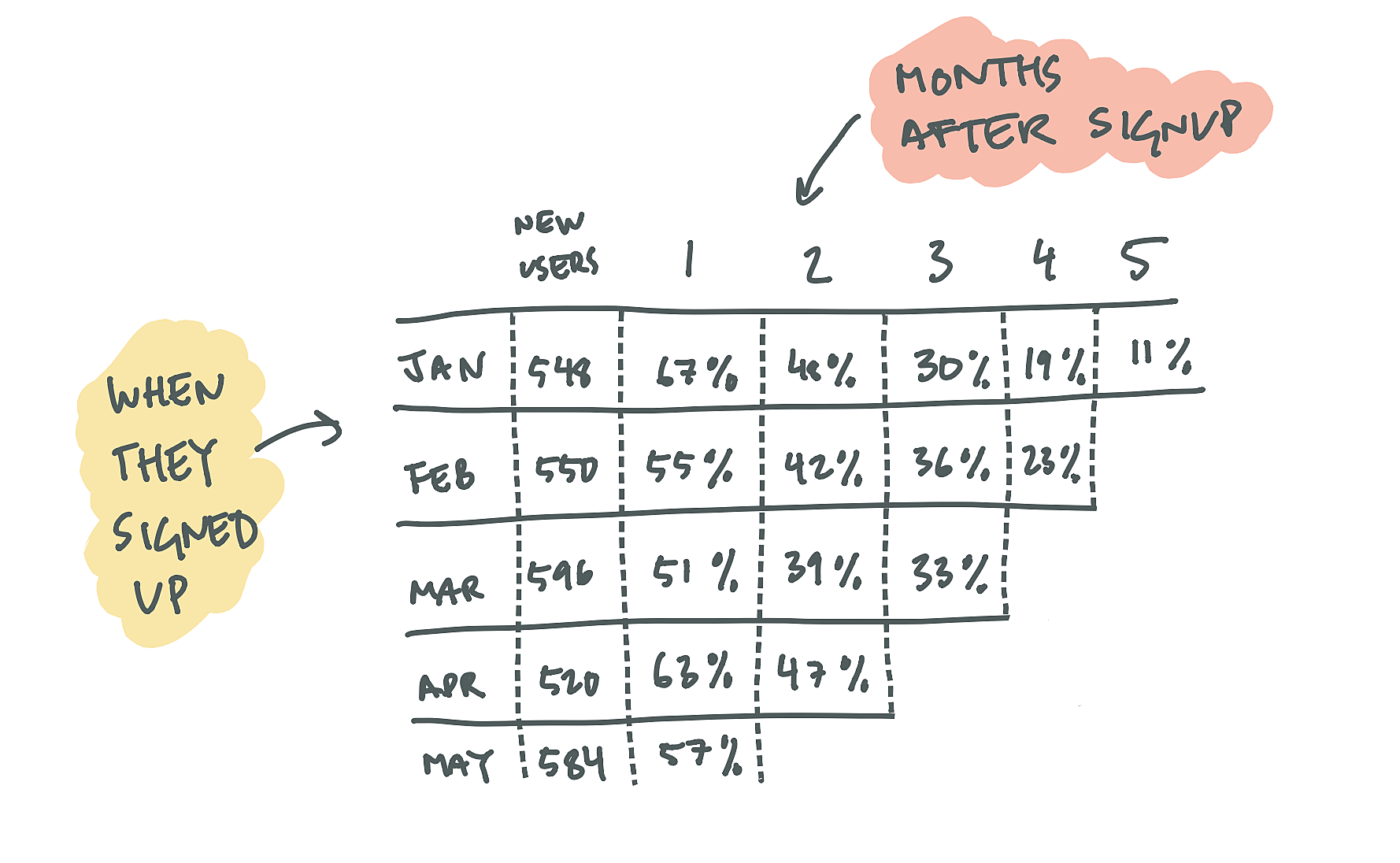
The first column in a cohort chart corresponds to a time interval. If your usage frequency is monthly then it groups people by the month they signed up. The row shows you what percentage of people continue to perform the core action each month after they signed up.
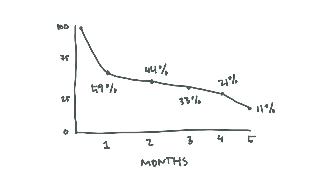
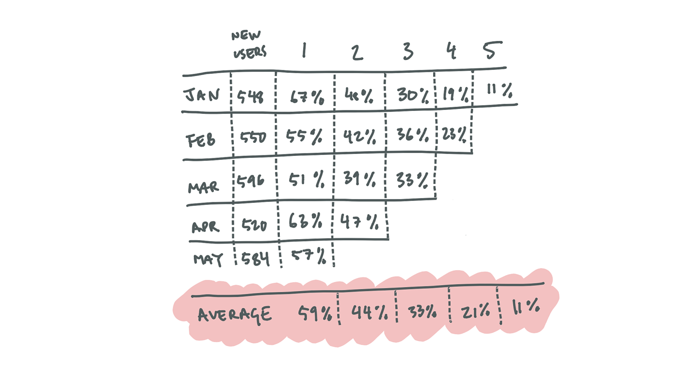
Cohort charts are great for spotting changes from month to month, but they are confusing to look at. I prefer to average all the columns out and plot them on a curve instead.
…and voilla, a retention curve!